Last Updated on June 7, 2021 by cwl
Bummer. The New York Times now has an account requirement to view its Covid reopening map. FYI.
I’m not a big fan of the New York Times, but I just ran across a very valuable resource here:
https://www.nytimes.com/interactive/2020/us/states-reopen-map-coronavirus.html
It appears to be updated daily. Perhaps even more valuable is the state-by-state summary that also includes a graph of the 7 day average of cases from March 2020 to present. What I found interesting is that most of the graphs show the same overall pattern – a resurgence of cases in November 2020, with a downward trend by February 2021. To me that looks like a typical flu season.
A Mises article from April 21, 2021 notes that Georgia and Florida lifted restrictions earlier than most states. Their case charts show a “bump” in cases during July and August 2020, then a tapering off until November. Herd immunity being established after the restrictions were removed?
The Mises article also has a state-by-state graph of cases and fatalities, which I reproduce here:
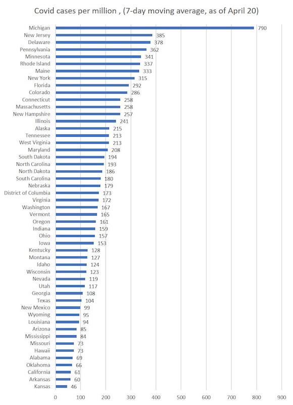

Comparing the data from both sources, one could perhaps be forgiven for concluding that lockdowns, business restrictions and mask mandates are not affecting the virus in any significant way. But by all means wear your mask when you go out because it shows that you care. Sigh.
References
Coronavirus Restrictions and Mask Mandates for All 50 States
Texas Ended Lockdowns and Mask Mandates. Now Locked-Down States Are Where Covid Is Growing Most